The significance is a statistical measure of frequency error you would get if you averaged the frequency error over that duration of time, $\tau$, as compared to the average over a same duration of time, that much time prior. So it is a measure of the difference in error, and specifically the rms value of many of these measurements. This is useful for non-stationary processes such as frequency noise since this difference operation can remove drift and over short time intervals result in a converging stationary process.
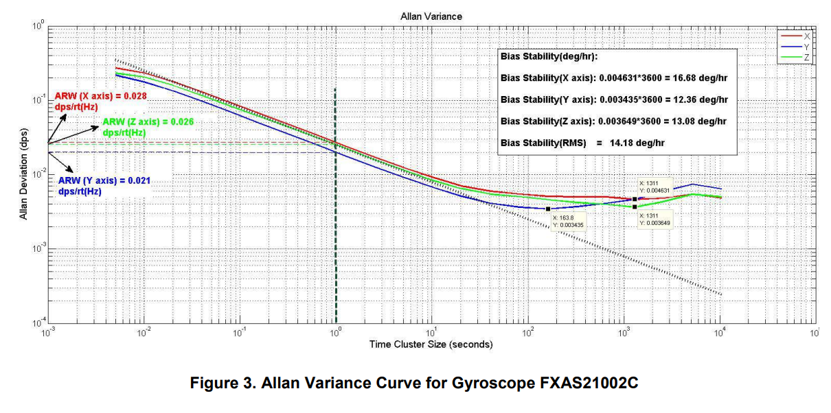
In your case, with a y-axis value of 7 degrees/Hr and a horizontal axis of 10 seconds, this indicates that the error from the gyroscope as compared to what it reported 10 seconds prior would be 7 degrees/Hr rms. (it is actually confusing to use "Y-axis" as they refer to the X Y and Z axis of the gyroscope itself). This measurement is done specifically by taking consistent measurements at some update rate (could be 1/second or 10x / second) etc but this would dictate the left most value on the horizontal axis and this measurement represents the average value over that duration, then for each value $\tau$ (the averaging interval) on the horizontal axis, these measurements are averaged, the averages are differenced over the duration $\tau$, and then from these differences an rms value is computed (how many differences are used dictates a confidence interval in the result). The computation can be done by an overlap approach, resulting in many more individual results for the rms computation from the same duration of time and therefore a tighter confidence.
Typically for ADEV in the clock world (where I currently work), the y-axis is given as fractional frequency error and the horizontal axis is averaging time in seconds for a given observation time. A white frequency noise process would result in the ADEV going down at the rate of $1/\sqrt{\tau}$ which means as we continue to observe the signal over longer durations the rms error goes down at the inverse of the square root of the averaging time. You see this specifically in the example plot they give in Freescale's app-note that I copied below for the gyroscope in that the error is indeed going down at $1/\sqrt{\tau}$: for 2 decades on the x-axis, the error as indicated by the y-axis drops 1 decade. This is the tell-tale sign of a white-FM process, meaning over these time durations the frequency noise is a stationary white noise process. For frequency sources, as we average longer and longer we eventually become affected by non-white noise sources as we approach DC in the frequency domain ($1/f$ noise, then $1/f^2$, etc) resulting in the ADEV plot bottoming out and then starting to increase as averaging time is further increased (from frequency drift), indicating where we would actually begin to have variation in our mean if we continued to average longer. You see this is their plot starting around 10 seconds and bottoming out around 1 minute.

So for the blue trace in the above plot, which bottoms out first, this is indicating that if we had the luxury of time, then we could take advantage of the stationary signal and average the output of the gyroscope for 163 seconds, and we would be able to get the best estimate of the mean (lowest error), but if we averaged longer, the error in our result would start to increase (non-stationary so there is no stable mean to average to).
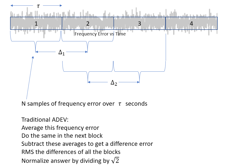
To further help in understanding ADEV, below shows the calculation for ADEV at one averaging time $\tau$. Typically the ADEV is computed over a range of different $\tau$ values, and this result is plotted a an rms error versus $\tau$. Also there is the Allan Variance (AVAR) which is simply the square of the Allan Deviation.

The result is a statistical estimate based on the rms over many of the blocks as diagrammed above. A variant of the computation is done by overlapping the blocks as diagrammed below. This is really a minor detail in that both approaches converge to the same answer, given enough samples. This second approach results in more differences to rms in the same amount of time and therefore would have a tighter confidence interval. For this reason, this is the approach I always take when computing ADEV.

For a further example of the use and utility of the ADEV plot, see this answer: What determines the accuracy of the phase result in a DFT bin?


