0
$\begingroup$

I was trying to identify Quantization Noise, Angle Random Walk, Bias Instability, and Rate Random Walk from Allan Variance plot which as Allan deviation on y axis and Sampling Time Interval T on x axis. Several sources [1][2] say that we can read these values directly from the plot when T=3^1/2, T=1, Slope=0, T=3 respectively. I am trying to understand why is this the case.

Here is my understanding: Allan Variance (AVAR) plot is generated by calculating AVAR at different sampling intervals T. Different noise processes have different slopes and they appear in different regions of T. Now, "its empirical observation" (and there is no mathematical proof as such) that Allan Variance plot is sensitive to different noise process at different sampling intervals T. For example, Allan Variance plot is sensitive to random walk component at T=3, while sensitive to white noise component for T=1. Thats why we simply read y axis deviation values for these different x axis T values to obtain corresponding values for these different noise processes.

Am I correct with this? That is this mapping of noise processes to different values of T is purely based on empirical observation of how these noises appear in sensors?

$\endgroup$

1 Answer 1

1
$\begingroup$

No I believe there is some misunderstandings here.

The horizontal line on the AVAR (and ADEV) typically shows $\tau$ which is the "averaging time" while the OP has referred to it as the "sampling time". They will be equivalent as long as the waveform has been boxcar averaged prior to sampling. The start of the curve on the left side of the plot (smallest $\tau$) is the reciprocal of the sampling rate used as $1/T$, and typically the remaining results for all higher $\tau$ are computed by averaging those same samples over different averaging intervals, and thus the results that can be computed are at $\tau=1/T, 2/T, 3/T \ldots $.

The ADEV and AVAR plots have specific slopes for different noise processes, and these slopes are backed up with detailed mathematical calculations consistent with the statistics of noise processes in the time and frequency domain. You can find such calculations in the Handbook of Frequency Stability Analysis by Bill Riley as well as its references.

For example, when we use AVAR and ADEV to measure the frequency stability of oscillators (one popular application for the tool), a white FM process (white freq noise) will have an ADEV slope that goes down linearly on a loglog curve at $1/\sqrt{\tau}$. This is also consistent with the standard deviation of a white noise process going down at $1/\sqrt{\tau}$ when we average the white noise over a time duration equal to $\tau$.

White phase noise on the other hand has an ADEV slope that goes down at $1/\tau$. This is consistent with phase noise being the integral of frequency noise.

The relationship between ADEV and different noise statistics is often summarized on a single ADEV plot such as what I pasted below (which came from Riley's publication referenced above):
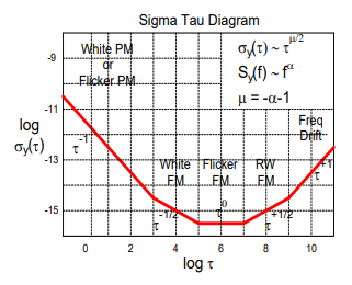
ADEV

I think having them all on one plot caused some confusion for the OP. This is how a typical ADEV plot may appear as different noise processes become dominant in different averaging intervals, but it may be clearer just to consider this plot as showing all the different possible slopes on one convenient plot. It does not mean that any of them would appear at a specific averaging interval $\tau$, or for that matter at any specific absolute level of $\sigma_y(\tau)$. They do typically transition through the different regions in the order shown, but the actual $\tau$ where White FM transitions to Flicker FM (for example) can be anywhere depending on the actual stability of the waveform being processed.

ADEV and AVAR are just convenient measures of stability typically used for waveforms that are not stationary in the long term where traditional first and second order statistics could otherwise be used (oscillator phase noise and gyroscope bias instability are two common examples). So like we measure the standard deviation of a stationary random process (constant mean, constant standard deviation) and from that access how "noisy" it is, we can make the same measurement with ADEV, except in this case we need to choose a specific time interval to average the waveform over, and at that time interval we can get a metric that is equivalent to the standard deviation (it is a standard deviation of differences specifically, as explained in the first post I linked). As we change the time interval we will get different results according to the type of noise process we have (unless we have "Flicker FM" noise as the plot above shows in that case we would get the same ADEV result everywhere independent of averaging time $\tau$.).

Please refer to this other post for further details on these concepts as I show the specific computation process for ADEV.

$\endgroup$
5
  • $\begingroup$ Aah, I miss used the term "sampling time". I indeed mean "averaging time". Correct me again if am wrong: sampling time is how frequently we obtain readings from the sensor. $$\text{Averaging time} = \text{number of samples in cluster used to calculate AVAR} \times \text{sampling time}$$ [ page 28 of this pdf ]. [continued ...] $\endgroup$
    – Mahesha999
    Commented Jan 17 at 12:55
  • $\begingroup$ [...continued] Also, I know that those different noise processes does not occur at specific $\tau$ but over a range of $\tau$. My question was why all articles / tutorials ask to measure these different noises at specific $\tau$. For example this comment asks to read white noise at $\tau=1$ and random walk at $\tau=3$. Page 30 of pdf stated in earlier comment asks to read quantization noise at $\tau=\sqrt{3}$ and random walk at $\tau=3$. Why is this so? $\endgroup$
    – Mahesha999
    Commented Jan 17 at 12:55
  • $\begingroup$ For that particular plot, that is where those noise types were dominant (based on the slope in the curve itself). Why this happens is based on the quality of the device. I have another recent post that demonstrates a process that is drifting long term, but if we only observe over short intervals it would appear (and mathematically be equivalent) to be stationary constant mean white Gaussian noise. I'll add the link to that. $\endgroup$ Commented Jan 17 at 12:58
  • $\begingroup$ (My current day job is designing atomic clocks so I am familiar with this from that regard - we spend a lot of effort to make frequency sources that will have frequency noise that maintains itself as white noise for VERY long time intervals-- so a higher quality device such that the random walk noise (due to eventual drift as all things will) occurs at much higher taus. That is what I mean by higher quality device. $\endgroup$ Commented Jan 17 at 13:00
  • $\begingroup$ Here is the link to the other post I mentioned demonstrating the same waveform transitioning from constant mean white noise to random walk: dsp.stackexchange.com/questions/91692/… . I also rephrased my answer as you are technically not incorrect referring to $\tau$ as the sampling interval as it will still work if you sample properly (boxcar avg first), but it can be misleading and "averaging interval" is much clearer to me in its use, purpose and computation. $\endgroup$ Commented Jan 17 at 13:03

Your Answer

By clicking “Post Your Answer”, you agree to our terms of service and acknowledge you have read our privacy policy.

Not the answer you're looking for? Browse other questions tagged or ask your own question.