1
$\begingroup$

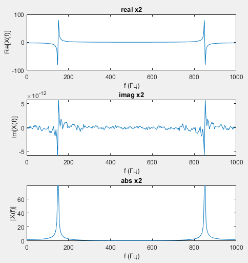
A little story. At the university, I did laboratory work on expanding functions into the Fourier series. I have this drawing. My teacher told me he is faithful. But he asked me this question: "Why does a harmonic signal with a frequency of $150 ~ Hz$ have such a complex spectrum?"

I decided that it made a difference for the two peaks at $150 ~ Hz$ and $850 ~ Hz$.

Answered as follows:
$$ \sin \left( \phi \right) = \frac{e^{i \phi} - e^{-i \phi}}{2 i} \tag{1} \label{1} $$

$$ \eqref{1} \rightarrow A \sin \left( 2 \pi f t \right) = \frac{A}{2 i} \left( e^{2 \pi i f t} - e^{2 \pi i f t} \right) \tag{2} \label{2} $$

For a sine wave signal, the Fourier transform has two peaks: one at the positive frequency and one at the negative frequency.

Teacher's answer:
You answered the wrong question I asked. Euler's formula is useful when you want to show the spectrum of sine waves mathematically. In order for the symmetry of any signal to be visible, it is necessary to display it over the full period of influence, either from $-\frac{F_{s}}{2}$ to $\frac{F_{s}}{2}$, or from $0$ to $F_{s}$. The symmetry of what is happening is visible. The question is why the spectrum of the signal related to one harmonic of $150 ~ Hz$ has a complex appearance at the top of the figure."

I don’t really understand how to answer this question and I’ve been trying to submit my work for $3$ weeks now. Maybe someone can tell me.

$T = 0.25 с$, $d t = 0.001$, $f_{1} = 150 ~ Hz$, $x = A \sin \left( 2 \pi f t \right)$

Code

T = 0.25;
dt = 0.001;

f1 = 150;

Fs = 1/dt;
N = fix(T/dt);
t = 0:dt:(N-1)*dt;
f = (0:N-1) * Fs / N;

x1 = sin(2*pi*f1*t);

X1 = fft(x1);

rest_x1 = ifft(X1);

subplot(3,2,[1,2]), plot(t, x1), title('Signal | Time domain');
xlabel('t (sec) '), ylabel('x1(t)');

figure;

subplot(3,2,[1,2]), plot(f, real(X1)), title('real x1');
xlabel('f (Hz)'), ylabel('Re[X(f)]');

subplot(3,2,[3,4]), plot(f, imag(X1)), title('imag x1');
xlabel('f (Hz)'), ylabel('Im[X(f)]');

subplot(3,2,[5,6]); plot(f, abs(X1)), title('abs x1');
xlabel('f (Hz)'), ylabel('|X(f)|');

enter image description here enter image description here

$\endgroup$
6
  • $\begingroup$ I don't quite understand what you are asking. Are you asking why the frequency spectrum is symmetric? Or are you asking why the spectrum is nonzero in places you would theoretically expect it to be zero? Or something else? $\endgroup$
    – Harry
    Commented Oct 21, 2023 at 18:00
  • $\begingroup$ Sorry, I did not notice your comment. Anyway the question is why the graphic Re[X(f)] is 80 and -80 on y-axis. And what y-axis shows? $\endgroup$ Commented Oct 25, 2023 at 8:09
  • $\begingroup$ Without seeing your code, I don't know exactly what you have plotted. Please add your source code to the question. $\endgroup$
    – Harry
    Commented Oct 25, 2023 at 10:22
  • 1
    $\begingroup$ I think you need to use the function fftshift in matlab fr.mathworks.com/help/matlab/ref/fftshift.html otherwise your x-axis does not fit to your spectral values. You should have peaks at +150Hz and -150Hz and not at 850Hz. The 850Hz only show up because of the sampling frequency of 1000Hz that you chose (1000-150=850). $\endgroup$ Commented Oct 26, 2023 at 13:58
  • 1
    $\begingroup$ I assume that you don’t understand why the real part has both positive and negative values right? What did you expect the amplitude values to be? To me, it’s not very easy to deduce what is going on and if something is wrong with the real and imaginary parts of the spectrum. From your amplitude plot, it seems that you have some leakage. I suggest you change your frequency so that the duration of the signal is an integral multiple of its period. This will get rid of the leakage and come closer to your "continuous time expectations”. $\endgroup$
    – ZaellixA
    Commented Oct 26, 2023 at 17:40

3 Answers 3

1
$\begingroup$

In your code, $T=0.25$ seconds, so in frequency domain the frequency resolution is $1/T=4\ Hz$, while your peak frequency $150\ Hz$ is not a multiple of $4\ Hz$. Try to change $T$ to, e.g., $T=1.0$, so that $150\ Hz$ is a multiple of $1/T$.

$\endgroup$
1
$\begingroup$

I dunno if anyone mentioned this, but your Imag x2 plot is $10^{-12}$ scaled. It's trying to be zero, but numerically didn't in the FFT.

The spectrum of the real and abs makes sense. It's a nearly purely real spectrum but for accumulated quantization noise.

$\endgroup$
1
  • $\begingroup$ This was meant to be a comment. $\endgroup$ Commented Oct 27, 2023 at 1:27
0
$\begingroup$

Since the harmonic frequency is not on the DFT grid - it lies between the nearest grid frequencies - 148 Hz and 152 Hz. Therefore, most, but not all, of the harmonic power is equally split between them, and the graph shows two peaks instead of one.

$\endgroup$
3
  • $\begingroup$ Could you please elaborate a bit? The two peaks in the magnitude spectrum are due to the fact a (co)sinewave is a real signal (in the time domain) and when you transform it to the frequency domain it has two complex conjugate values (if we don’t take into account leakage). Is this what you refer to, or I am missing something? $\endgroup$
    – ZaellixA
    Commented Nov 27, 2023 at 22:42
  • $\begingroup$ The abs x2 subplot shows two peaks around 150 Hz and 850 Hz. But each of these peaks has "a complex appearance in the top". You can zoom the peak around 150 Hz and see that there are actually two peaks. I think the teacher asked you to explain this DFT behavior. See Figure 2 plot 4 in en.wikipedia.org/wiki/Spectral_leakage $\endgroup$ Commented Nov 28, 2023 at 12:24
  • $\begingroup$ Well the teacher hasn’t asked me to explain anything, but that’s fine. What I suggest though is to explain your thinking a little bit in more detail so that the OP will be able to actually understand the reason behind this behaviour $\endgroup$
    – ZaellixA
    Commented Nov 28, 2023 at 18:27

Your Answer

By clicking “Post Your Answer”, you agree to our terms of service and acknowledge you have read our privacy policy.

Not the answer you're looking for? Browse other questions tagged or ask your own question.