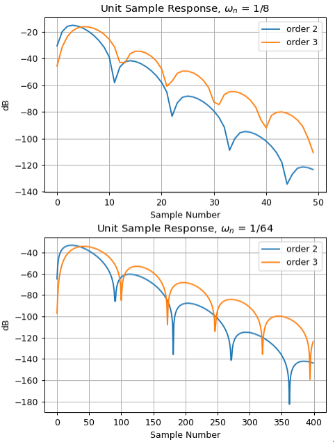
I am not sure if I use the correct term which may be the reason why I was not able to find the answer, but what I mean by the warm-up period is the number of samples required for the filter to produce valid values in the output. Visually I am guessing that it depends on the order and the cut-off frequency, and is roughly a division of the former by latter, but it does not seem to be a strict measure, because it holds better for higher cut-off frequency than lower, but I may be wrong as my judgement is based on the looks of the plots like in this toy example in Python:
import numpy as np
import matplotlib.pyplot as plt
from scipy.signal import butter, lfilter

l = 256
x = np.arange(l)
#y = (1/8)*np.sin(8*x + np.pi/8) + (1/4)*np.sin(4*x + np.pi/4) + (1/2)*np.sin(2*x + np.pi/2)
#y = 8*np.sin(x/8 + np.pi/8) + 4*np.sin(x/4 + np.pi/4) + 2*np.sin(x/2 + np.pi/2)
y = (1/128)*np.sin(x/128 + np.pi/128) + (1/64)*np.sin(x/64 + np.pi/64) + (1/32)*np.sin(x/32 + np.pi/32) + 1/2
fig, axs = plt.subplots(2, sharex=True)
axs[0].plot(y, c='k')
axs[1].plot(y, c='k')
for order in (1, 2, 3):
        b, a = butter(order, 1/8, 'lowpass')
        axs[0].plot(lfilter(b, a, y))
        b, a = butter(order, 1/64, 'lowpass')
        axs[1].plot(lfilter(b, a, y))
fig.show()
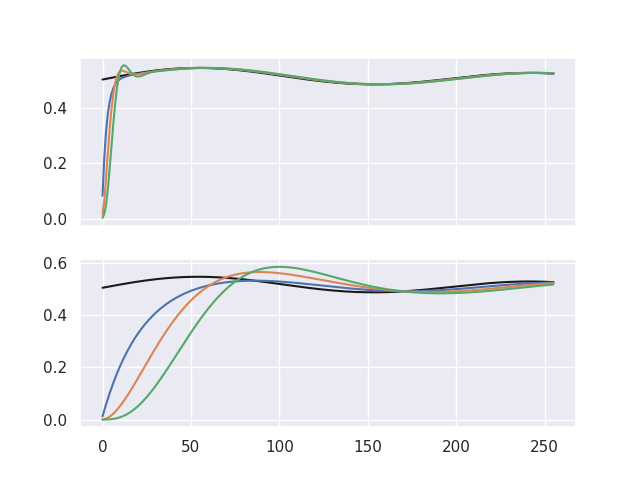
which produces a figure:
where the black curve is the original signal y and the colored lines are its filtered equivalents: blue - 1st order, orange - 2nd, green - 3rd. After zooming in on the top plot one can see that the blue line picks up around x = 8, orange around x = 16 and green around x = 24, so one would expect to see on the bottom plot the blue line picking up around x = 64, orange around x = 128 and green around x = 196 which kind of looks like that for blue and orange, but not quite for the green one. Of course there is a lag in play that makes it even more difficult to judge, so my question is: how to calculate the number of samples needed for a Butterworth filter to produce valid results?


