I have done a power spectrum density estimate using Bartlett's method. However, I was wondering if it is also possible to get a sense of the variation of the averaged spectra.
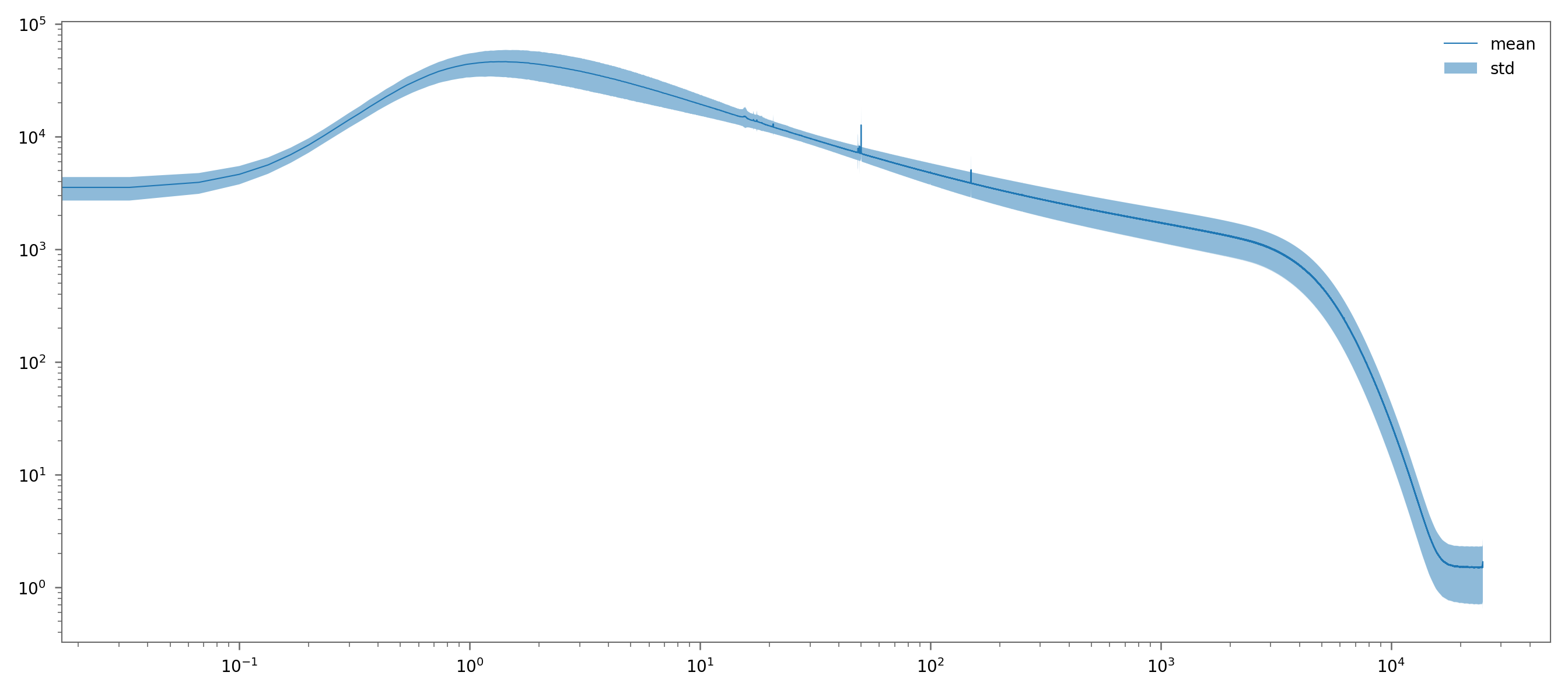
I have plotted the mean and std of the DFT amplitudes (no normalisation), which at least does not look completely off.

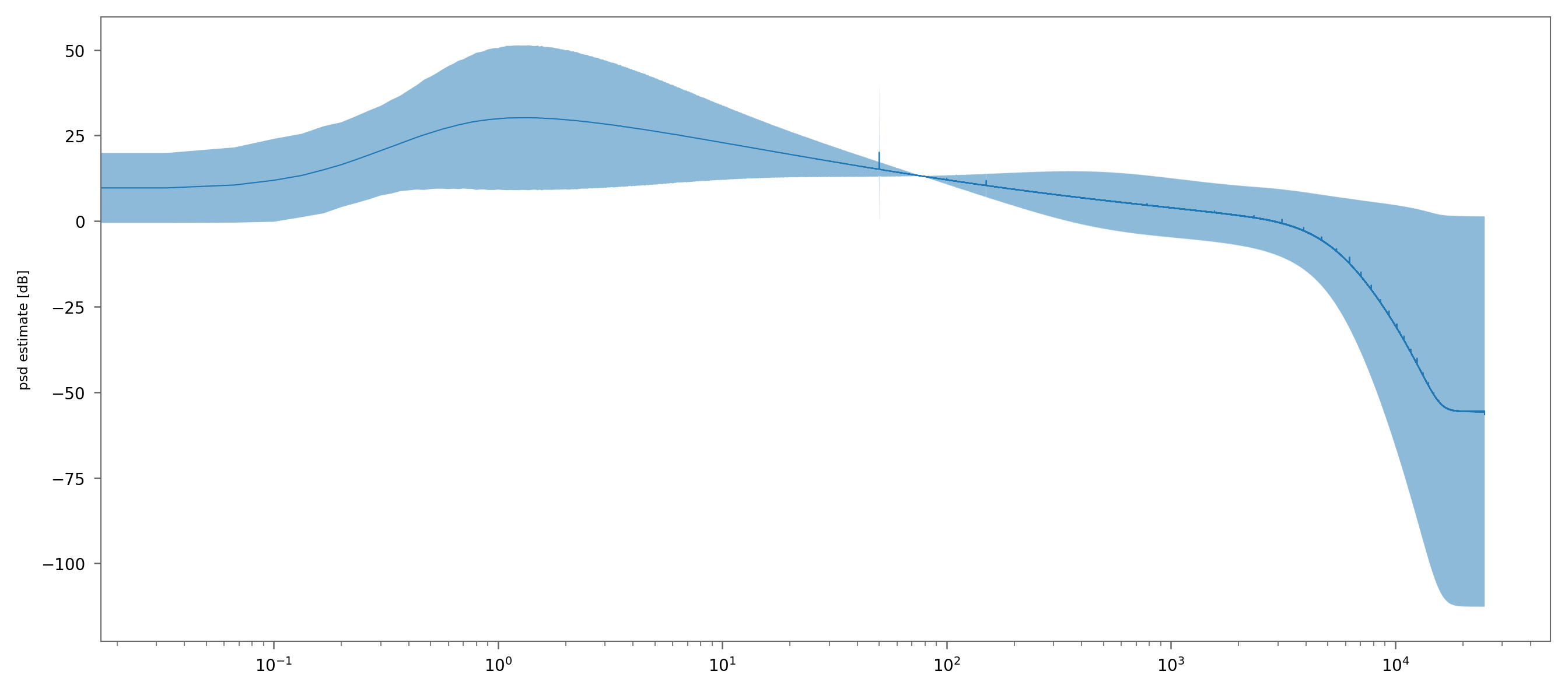
However, when I plot the power spectrum density estimate with mean and std in dB-scale, the signal looks of when the power density estimates is around 0dB. This makes mathematically sense, since everything around $log(1)$ will be zero. However, I lack an intuition about the interpretation of the plot.
I was wondering if one would actually plot it like this, since it is somehow misleading. Here is the plot:
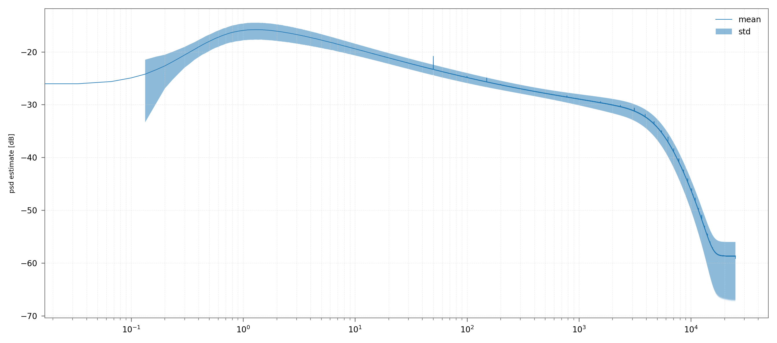
Now calculating first the difference and than the dB scale, leads to the expected graph.
Thanks in advance!


