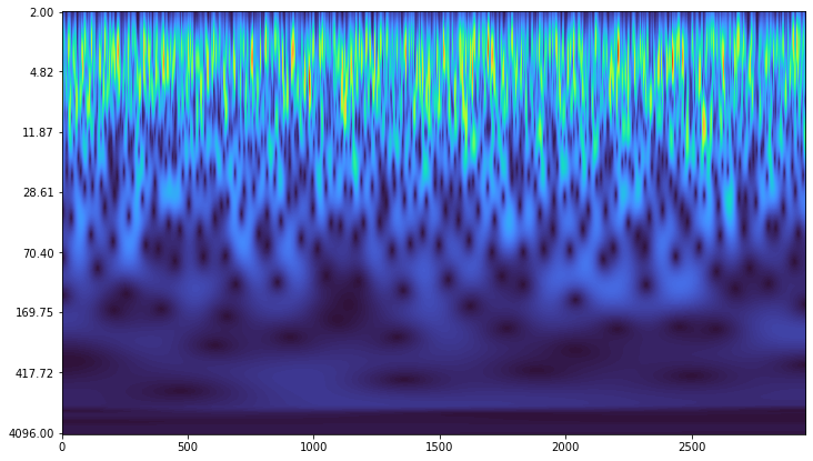
This is a question about producing a time/period (1/frequency) plot from a CWT, instead of the time/scale output. I am trying to use the ssqueezepy python library to perform the CWTs. Then I understand I need to convert the scales into pseudo-frequencies to make the plot.
I have a dataset which I want to transform here. The sampling rate is fs = 1 sample per day (not Hz). I want to generate a time/period plot, with period = 1/frequency. I am specifically searching for signals in the 30-60 day period band, so I would like to have that range visible on the y axis.
My dataset has a number of peaks, so I am using the Mexican hat wavelet. In particular I am interested in the periods of the smaller amplitude peaks in the 30-60 day band.
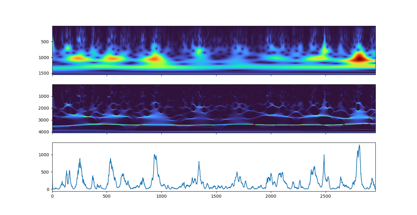
Below are plots of the CWT (top) SSQ_CWT (middle) and original time series (bottom). The SSQ_CWT from ssqueezepy returns normalized frequencies, and I tried to plot 1/(f*fs) on the vertical axis of the middle panel to get period in days, as fs=1 sample per day. However it doesn't seem to work correctly.
I would be grateful for help from anyone familiar with CWTs and the ssqueezepy library to explain how to convert the CWT output into pseudo-frequencies and then plot a time/period map. The code I am using is:
import numpy as np
import matplotlib.pyplot as plt
from ssqueezepy import ssq_cwt, ssq_stft

# read signal
x = np.loadtxt("data.txt")

# CWT + SSQ CWT
Tx, Wx, freqs, scales, *_ = ssq_cwt(x, wavelet='cmhat')

fig, (ax1, ax2, ax3) = plt.subplots(3, 1, sharex=True)

extent = 0, 2954, np.max(scales), np.min(scales)
ax1.imshow(np.abs(Wx), aspect='auto', cmap='turbo', extent=extent)

extent = 0, 2954, 1 / np.min(freqs), 1 / np.max(freqs)
ax2.imshow(np.abs(Tx), aspect='auto', vmin=0, vmax=20, cmap='turbo', extent=extent)

ax3.plot(x)

plt.show()


