The other answers are good, but I thought that I would try to give a more intuitive/visual answer since I am an intuitive/visual guy.
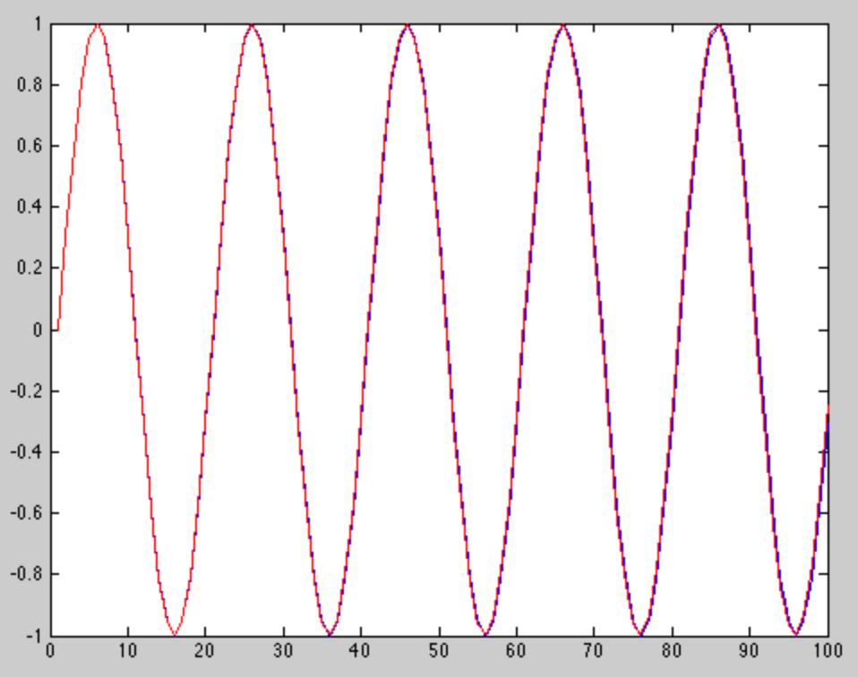
The picture below is the plot of two tones that are almost the same frequency. One tone is plotted in red, and the other in blue.

I generated the picture in Matlab with the following code:
tone1 = sin(2*pi*.05 * (0:99));
tone2 = sin(2*pi*.0501 * (0:99));
plot(tone1)
hold on
plot(tone2, 'r')
As you can see from both the picture and the code, the two tones are very close in frequency. They are starting to separate a bit towards the end of this short window, but they are still very similar, to the point where a DFT could not tell them apart.
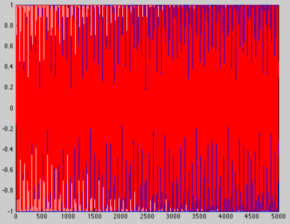
If I create the same tones with the same frequencies, only I make the window longer (5000 samples this time instead of 100) we get a much different picture. Obviously there will be more cycles in each tone...

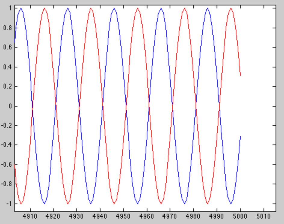
... but that's not the interesting part. We see the interesting part when we zoom in at the end of the window.

We see that the two tones are 180 degrees out of phase at the end of the window, which makes them very easy to distinguish. So how did I know to pick 5000 samples? The difference in the two tones is $.0002\pi \frac{radians}{sample}$, so $5000$ samples $* .0002\pi \frac{radians}{sample} = \pi$ radians.
As another answer mentioned, the resolution of the DFT is the sample frequency divided by the number of samples (i.e. the window length). I implicitly made the sample frequency 1, so if we divide 1 by 5000 (the number of samples), we get that the resolution is .0002 Hz. Our tones actually differ by .0001 Hz, meaning that tone2 will have energy in both tone1's bin and the bin next to it (and a little bit in all the others too, but that's a different story).

