0
$\begingroup$

I've recorded the same audio signal using two microphones located at the same approximate location. However, when checking the cross-correlation using MATLAB (using the xcorr function) it is negligible, even though the signals look approximately the same and sound the same. The signals were brought to MATLAB using the audioread function. This scenario was repeated using a different set of microphones, achieving the same results.

Did anybody encounter this kind of problem in the past and has a solution?

EDIT: First of all, thank you all for the help. This is a scenario of two sources and two microphones in different locations in space. The signals clearly sound mixed (each signal contains both sources) and the microphones are synchronized and at the same sample rate of 44.1kHz. The code:

[x1,Fs1]=audioread('channel_1.wav');
[x2,Fs2]=audioread('channel_2.wav');
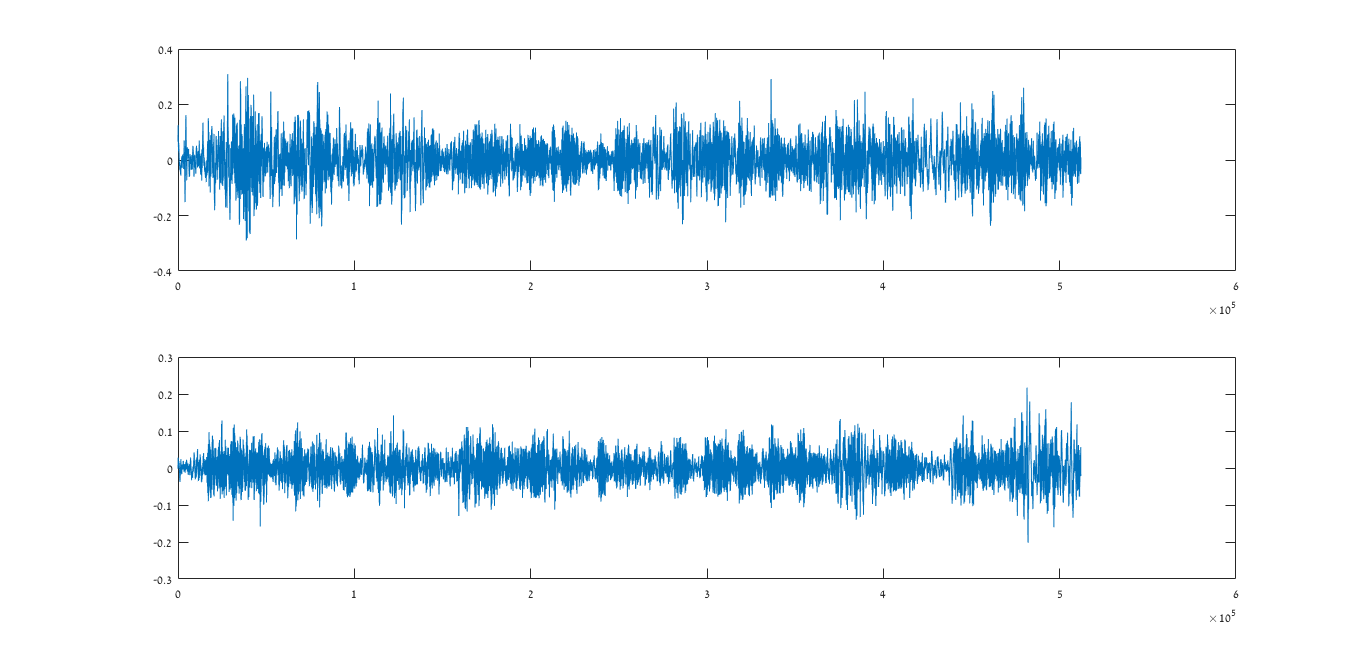
figure; subplot(2,1,1); plot(x1);subplot(2,1,2);plot(x2);
[R_11,lags]=xcorr(x1,x1);
R_22=xcorr(x2,x2);
R_12=xcorr(x1,x2);
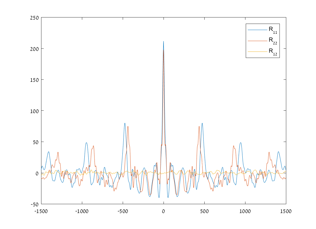
figure;plot(lags,R_11);hold on;plot(lags,R_22);plot(lags,R_12);

The correlations:

correlations plot

The signals:

signals plot

$\endgroup$
24
  • $\begingroup$ It would be helpful if you posted your plots and code. You might try the autocorrelation as a diagnostic $\endgroup$
    – user28715
    Commented Jun 11, 2018 at 17:06
  • $\begingroup$ Edited, now includes code and plot. $\endgroup$ Commented Jun 11, 2018 at 17:34
  • $\begingroup$ it looks like a problem but I don't know your sample rate or why you decided to specify a max lag of 1500. what kind of delay did you anticipate. $\endgroup$
    – user28715
    Commented Jun 11, 2018 at 17:57
  • 1
    $\begingroup$ Can you please plot the two waveforms in their own plot space? Something like subplot(211) for example. I get the impression that one of the waveforms is the reverse of the other (?). If the microphones are close by, why does the blue waveform start immediately and the orange one registers a delay? Also, if you notice, the orange waveform beginnings and endings do not match. You might get something like that in a church with tenths of meters between mics and sources but if they are close by there is no reason. $\endgroup$
    – A_A
    Commented Jun 12, 2018 at 12:47
  • 1
    $\begingroup$ The plots you have added show that the two recordings have not used the same same sampling clock: The distance between the red and blue peaks increases with increasing lag time. You are probably using two unsynchronised devices for the recording. The time base difference is even large enough to suggest two entirely different sampling rates, like @Marcus Müller suggested below. Triple check your sampling rates and use synchronisation. $\endgroup$
    – Jazzmaniac
    Commented Jun 12, 2018 at 14:23

1 Answer 1

2
$\begingroup$

This answer is now obsolete.

I still keep it, because future searchers might come here with similar problems.

This is not the signal as it is now, but as it was before, when I answered:

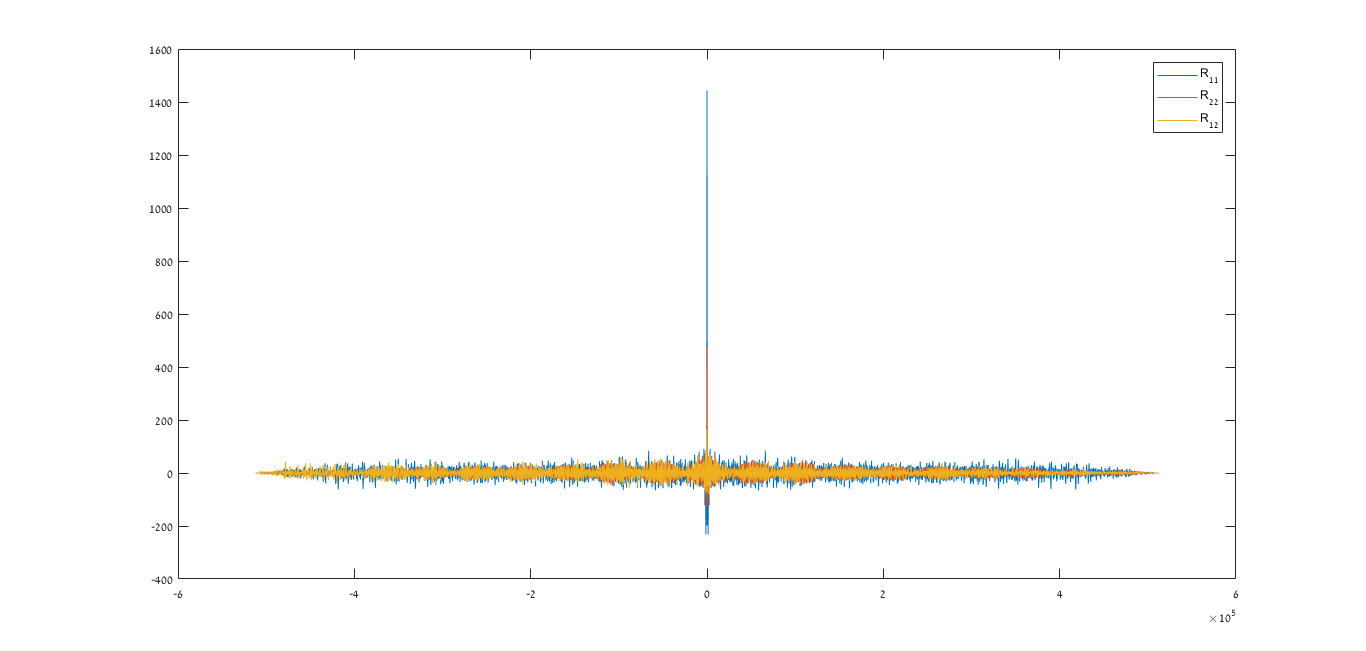
correlations plot

I'll do a hypothesis: the autocorrelation peaks are due to periodicity in your signal. But if that's the case, they should be the same for $R_{11}$ and $R_{22}$.

My guess is that you're comparing two recordings of different sampling rate (for example, 44.1 vs 48 kHz). But xcorr only sees the vector of numbers and doesn't know about the sampling rate!

$\endgroup$
1
  • $\begingroup$ Indeed you are right. I'll edit with different data. $\endgroup$ Commented Jun 12, 2018 at 16:44

Your Answer

By clicking “Post Your Answer”, you agree to our terms of service and acknowledge you have read our privacy policy.

Not the answer you're looking for? Browse other questions tagged or ask your own question.