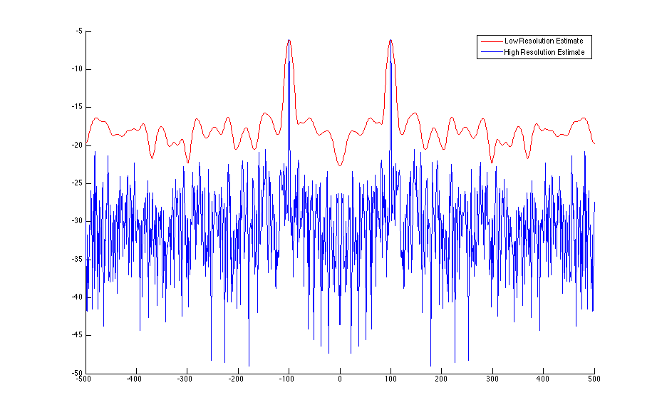
I created a sinusoidal wave in some noise, and plotted the power spectrum of the signal using two periodogram estimates (welch procedure). One estimate is 'high resolution' - i.e. it uses a longer window than the corresponding 'low resolution' estimate. The result and code used to generate it are shown below. For reference: the y-axis will have units of |signal|^2 and the x-axis are just FFT samples.
My question is: From the plot, it would appear that there is overall more power content in the low resolution (red) plot, although this is obviously not the case, the input signal is the same in both cases. This poses some questions about how we compare signals, it seems it is critical to use the same parameter values (like window lengths) when comparing the energy content of different signals.
For reference, I do understand that the length of the window in the welch estimate will determine the resolution of my spectrum, and that the number of FFT points used will determine the smoothness of my output, which has nothing to do with resolution.

Fs = 1000;
t = 0:1/Fs:1-1/Fs;
x = cos(2*pi*100*t)+randn(size(t));

nWindow1 = 100;
noverlap1 = 0*nWindow1;
nfft1 = 1000;
[pxx1, f1] = pwelch(x,hann(nWindow1), noverlap1, nfft1, Fs, 'centered', 'power');

nWindow2 = 1000;
noverlap2 = 0*nWindow2;
nfft2 = 1000;
[pxx2, f2] = pwelch(x,hann(nWindow2), noverlap2, nfft2, Fs, 'centered', 'power');

figure
hold on
plot(f1, 10*log10(pxx1),'r')
plot(f2, 10*log10(pxx2),'b')
legend('Low Resolution Estimate', 'High Resolution Estimate')
