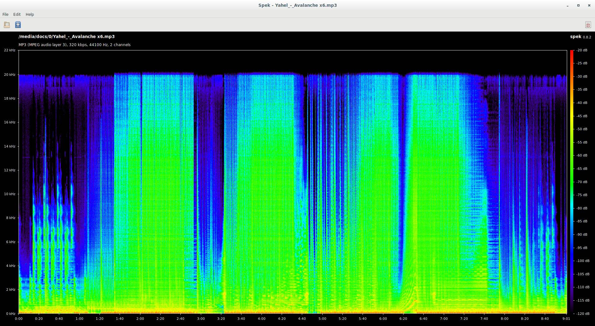
When comparing spectrum images between two different audio sources in order to determine which has better quality, I sometimes come to an impasse. For example, consider the following images from two 320kbps mp3 files:
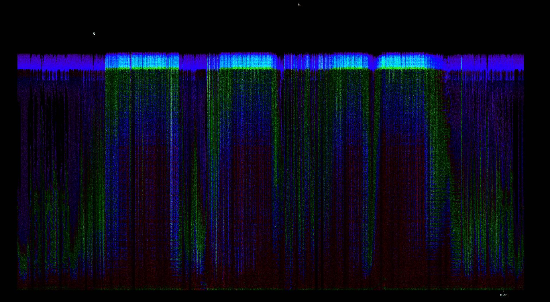
Optical difference of RGB values:
 (here is the difference between waveform-synced versions of the above examples, but it's quite the same)
The second version has a cutoff at 20 KHz, while the first contains some audio information above that frequency, albeit very low in intensity, and probably inaudible.
On the other hand, this extra audio portion at the top of the plot appears to be noise, since it's composed by an almost continuous "blurry" zone. In addition, looking carefully at the two images, some subtle differences can be observed at the lower frequencies.
I'm inclined to think that the second version is better quality, theoretically, since the lower cutoff limit may allow for the encoder to make better use of the available bandwidth, so that it can more acuratelly represent the lower frequencies. That aside, I really don't know how to interpreted those subtle differences between the two images in order to make an objective decision.
So, when comparing spectrum images, what specific details can help determine which encoder did a better job?


