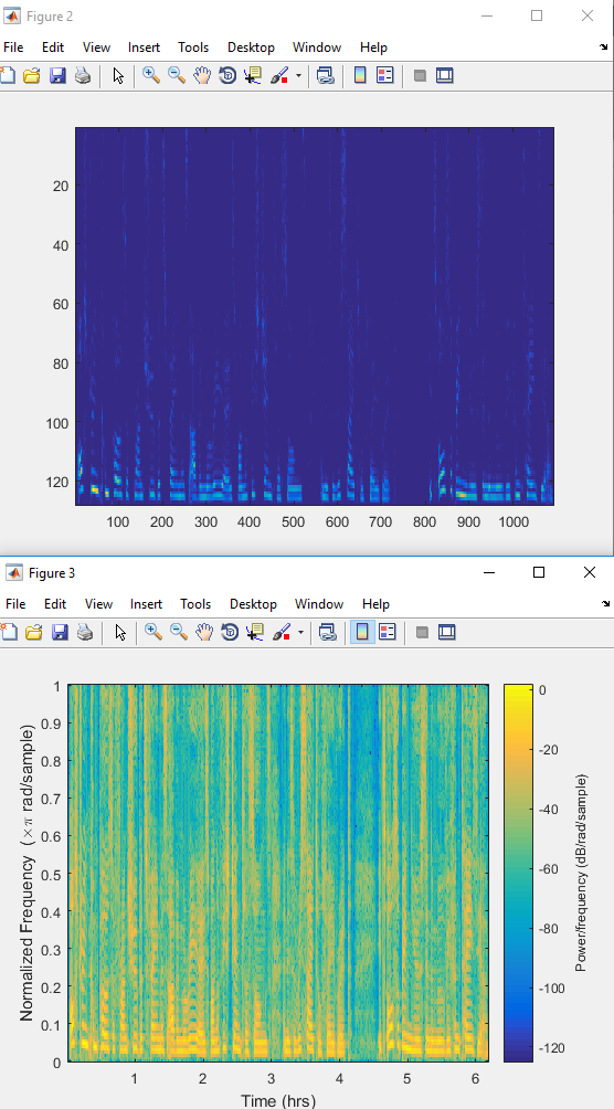
i wrote a function in MATLAB which will divide a audio waveform (a speech) into smaller windows with overlap .The output will be a matrix X, each column of which contains the windows which i export. Then i calculate the FFT of each column, i remove half of fft bins and i visualize the measure of each FFT frame as an image, using the "imagesc" command.Then i made a spectrogram of my signal and it gives me this figure. Im wondering if this two figures are the same or not. Ok it seems that maybe they are the same but why the colors for example are different? Or is there any other difference between this two figures?

$\begingroup$
$\endgroup$
2
1 Answer
$\begingroup$
$\endgroup$
2
The spectrogram is displayed on the log scale.
-
$\begingroup$ You mean that the 1st figure is diplayed on the log scale? and if indeed it is from where the log came from? as I described above, I didnt use log in my calculations $\endgroup$– GensdimiCommented Nov 28, 2016 at 13:56
-
2$\begingroup$ The spectrogram is on a log colour scale... For your image try
imagesc(log(data))$\endgroup$ Commented Nov 28, 2016 at 15:49

spectrogramif you had to do the comparison. $\endgroup$