I have a signal recorded at 2MHz sampling rate. Before any decimation might be required, I first looked for peaks in my periodic recorded signal using STFT/spectrogram. From here, I can clearly see some peaks. Using PSD I could find that the frequencies were not prominent after ~500kHz so I apply the Butterworth filter to filter out frequencies higher than this. Also my antenna records from ~20kHz so frequencies below this are also filtered out.
The sample.wav file can be downloaded here: https://www.dropbox.com/s/hcwrtuzqbipatri/sample.wav?dl=0
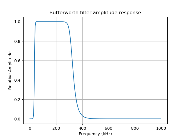
The filter amplitude response looks as follows:
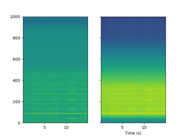
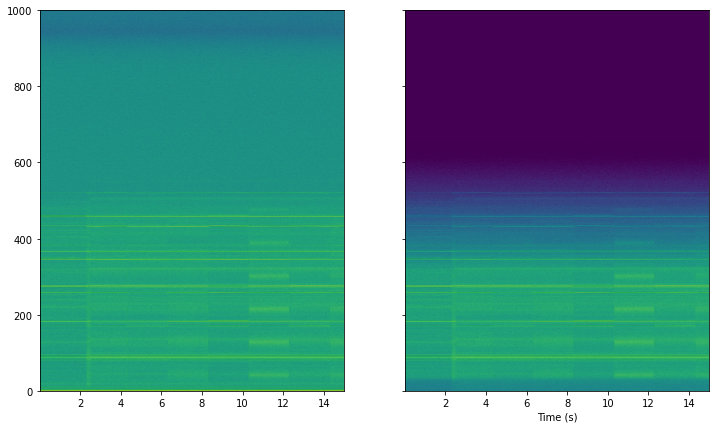
However, comparing the spectrograms for the original and bandpass filtered signals look fairly different and I can't seem to understand why. The original signal is on the left and the butterworth filtered signal is on the right. The y-axis scale is Frequency (kHz).
The code used for the filter can be viewed below:
import numpy as np
import os
import scipy.io.wavfile
from scipy import signal
# import librosa
import matplotlib.pyplot as plt
from sklearn.decomposition import PCA

fs, x = scipy.io.wavfile.read('sample.wav') # fs is 2MHz (2000000)
# Convert to mono by avg I (left) and Q (right) channels
x = np.mean(x, axis=1)
x = np.asarray(x, dtype='float')
# Once the recording is in memory, we normalise it to +1/-1
# x /= np.max(np.abs(x)) ## This is sensitive to outliers and rescaling is not consistent
x /= x.std()

t_tot = 1 / fs*x.shape[0]
t = np.linspace(0, t_tot, x.shape[0])
tmin = np.min(t)
tmax = np.max(t)
N = len(x)

f_l, f_u = 20000, 500000  # Band from 20kHz to 500kHz
wp = np.array([f_l, f_u])*2/fs  # normalized pass band frequnecies
ws = np.array([0.8*f_l, 1.2*f_u])*2/fs  # normalized stop band frequencies
b, a = signal.iirdesign(wp, ws, gpass=60, gstop=80, ftype="butter", analog=False)

# plot filter response:
w, h = signal.freqz(b, a, whole=False)
ff_w = w*fs/(2*np.pi)
fg, ax = plt.subplots()
ax.set_title('Butterworth filter amplitude response')
ax.plot(ff_w/1000, np.abs(h))
ax.set_ylabel('Relative Amplitude')
ax.grid(True)
ax.set_xlabel('Frequency (kHz)')
fg.canvas.draw()
# do the filtering:
zi = signal.lfilter_zi(b, a)*x[0]
x1, _ = signal.lfilter(b, a, x, zi=zi)
# calculate the avarage:
avg = np.mean(x1**2)
print("RMS values is %g" % avg)
plt.show()

fig, ax = plt.subplots(1, 2, sharex=True, sharey=True)
f, t, Sxx = signal.spectrogram(x, fs=fs, window='hann', nperseg=8192, scaling='spectrum')
ax[0].pcolormesh(t, f / 1000, 10 * np.log10(Sxx), shading='gouraud')

f_1, t_1, Sxx_1 = signal.spectrogram(x1, fs=fs, window='hann', nperseg=8192, scaling='spectrum')
ax[1].pcolormesh(t_1, f_1 / 1000, 10 * np.log10(Sxx_1), shading='gouraud')
# plt.set_title(f'nperseg={str(i)}')
plt.xlabel('Time (s)')
plt.ylabel('')
plt.show()


'sample.wav', and see if this or this works as expected. $\endgroup$sample.wavfile. $\endgroup$