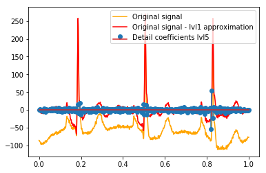
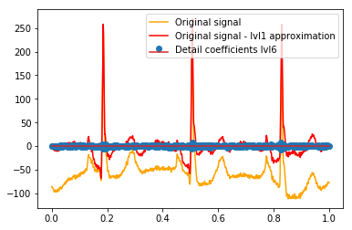
I'm trying to directly visualize the relation between discrete wavelet transform (DWT) detail coefficients and the original signal/its reconstruction. The goal is to show their relation in an intuitive way. I would like to ask (see questions below): if the idea and process I've come up with is correct so far, and if I am right that it might be better subtract the 1st level approximation from the original signal before visualizing their relation.
Minimal example
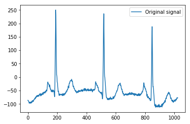
Here's the minimal example I base my explanation on, using the ECG example data of Python's pywavelets, which has 1024 values, as a simple 1D signal:
import pywt
import pywt.data
import numpy as np
import matplotlib.pyplot as plt

x = pywt.data.ecg()
plt.plot(x)
plt.legend(['Original signal'])
Decomposition is done using a Symmlet 5 with a total of 6 levels:
w = pywt.Wavelet('sym5')
plt.plot(w.dec_lo)
coeffs = pywt.wavedec(x, w, level=6)
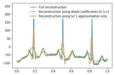
(Lossy) reconstruction of the signal works as expected when intentionally leaving out detail coefficients of higher levels (signals are plotted on uniform x-scale [0,1] for convenience):
def reconstruction_plot(yyy, **kwargs):
    """Plot signal vector on x [0,1] independently of amount of values it contains."""
    plt.plot(np.linspace(0, 1, len(yyy)), yyy, **kwargs)

reconstruction_plot(pywt.waverec(coeffs, w)) # full reconstruction
#reconstruction_plot(pywt.waverec(coeffs[:-1] + [None] * 1, w)) # leaving out detail coefficients up to lvl 5
#reconstruction_plot(pywt.waverec(coeffs[:-2] + [None] * 2, w)) # leaving out detail coefficients up to lvl 4
#reconstruction_plot(pywt.waverec(coeffs[:-3] + [None] * 3, w)) # leaving out detail coefficients up to lvl 3
reconstruction_plot(pywt.waverec(coeffs[:-4] + [None] * 4, w)) # leaving out detail coefficients up to lvl 2
#reconstruction_plot(pywt.waverec(coeffs[:-5] + [None] * 5, w)) # leaving out detail coefficients up to lvl 1
reconstruction_plot(pywt.waverec(coeffs[:-6] + [None] * 6, w)) # leaving out all detail coefficients = reconstruction using lvl1 approximation only
plt.legend(['Full reconstruction', 'Reconstruction using detail coefficients lvl 1+2', 'Reconstruction using lvl 1 approximation only'])
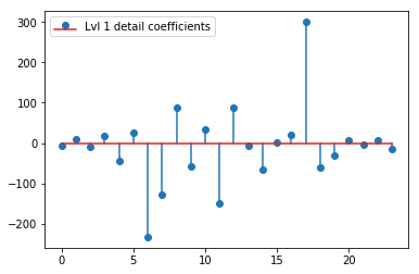
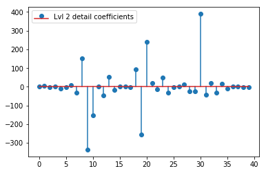
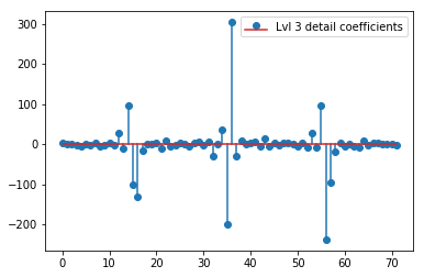
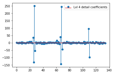
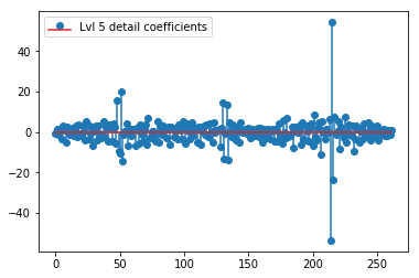
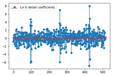
The DWT above yields a level 1 approximation vector of 24 values, level 1 details coefficient vector of 24 values, level 2 detail vector of 40 values, level 3 of 72 values, level 4 of 135 values, level 5 of 262 values, and level 6 of 516 values:
plt.stem(coeffs[1]); plt.legend(['Lvl 1 detail coefficients'])
plt.stem(coeffs[2]); plt.legend(['Lvl 2 detail coefficients'])
plt.stem(coeffs[3]); plt.legend(['Lvl 3 detail coefficients'])
plt.stem(coeffs[4]); plt.legend(['Lvl 4 detail coefficients'])
plt.stem(coeffs[5]); plt.legend(['Lvl 5 detail coefficients'])
plt.stem(coeffs[6]); plt.legend(['Lvl 6 detail coefficients'])
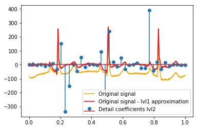
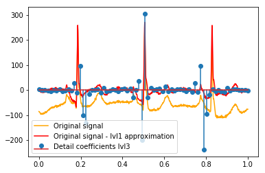
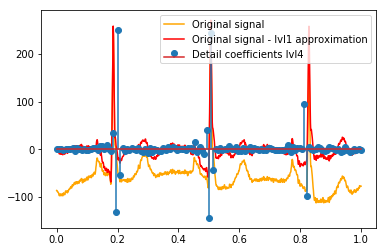
It seems we see clear patterns around the spikes in original signals (also pay attention to the y scale of the plots above).
Now to my questions:
- It is correct that we can directly relate those coefficients to the signal? Amplitude of the coefficient corresponds to amplitude with which the wavelet occurs in the signal (y axis), and position of the coefficient corresponds to the time (x axis). Or is there something in between we need to consider?
After the DWT the final lvl1 approximation remains. Does it make sense to not visualize the relation of the detail coefficients with the original signal, but instead with the original signal minus the lvl1 approximation? (I know that I would most likely also see the relation between coefficients and signal without doing this, see e.g. plots below. It's just for it this makes sense or not. Should it makes sense for lvl1 detail coefficients then it might also make sense for lvl2 detail coefficients to be compared to the original signal minus the lvl2 approximation, right?). An example:
# Reconstruction of signal using just lvl1 approximation
approx_lvl1 = pywt.waverec(coeffs[:-6] + [None] * 6, w)
# interpolate to original amount of samples (necessary due to numeric solution of transformation not yielding same amount of values)
approx_lvl1_interp = np.interp(x=np.arange(0, 1024), xp=np.linspace(0, 1024, len(approx_lvl1)), fp=approx_lvl1)
x_without_lvl1approx = x - approx_lvl1_interp
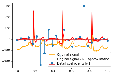
The direct visualization of the relation between detail coefficients and signal I use just plots both the signal and the coefficients on an x axis of [0,1]. This should conceptually be valid, but I am unsure if I would actually need an offset towards the margins (e.g. first and last coefficient of the vector not being positioned at the very beginning or end of the signal):
def reconstruction_stem(yyy, **kwargs):
    """Plot coefficient vector on x [0,1] independently of amount of values it contains."""
    plt.stem(np.linspace(0, 1, len(yyy)), yyy, **kwargs)

reconstruction_plot(x, color='orange')
reconstruction_plot(x_without_lvl1approx, color='red')
reconstruction_stem(coeffs[1])
plt.legend(['Original signal', 'Original signal - lvl1 approximation', 'Detail coefficients'])
Is there an intuitive explanation for the strong coefficients that are not directly at the positions of peaks in the original data (e.g. at level 1 the lowest one (strongest negative) at around 0.25, as well as the highest one (strongest positive) around 0.75)? Though there is a clear pattern (positive lag+negative amplitude, negative lag+positive amplitude) those seem a bit "far off" for me. But there is probably a good explanation for that.
Thanks for answering!

