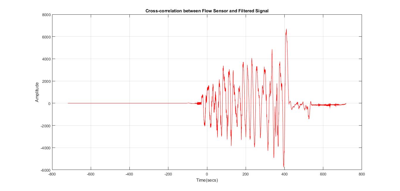
I am trying to measure the similarity between two signals and I am using cross-correlation to achieve this.
Following the matlab example, I seem to have accomplished that, however, I do not understand the plot that I am getting. In the matlab example the explanation that is given is: The first subplot indicates that the signal and template 1 are less correlated while the high peak in the second subplot indicates that signal is present in the second template.
My question is how does the peak indicate that the signals have more in common? Shouldn't the two signals be more correlated when the distance between them is lower?
Moreover, when I tried it using my two signals I received the following image:  which looks more than strange compared to the image from the example, as I have multiple peaks and a relatively long straight line.
