8
$\begingroup$

I have started looking into DSP and made an implementation of short-time fourier transform, using kissFFT to perform the FFT. I then render a spectrogram.

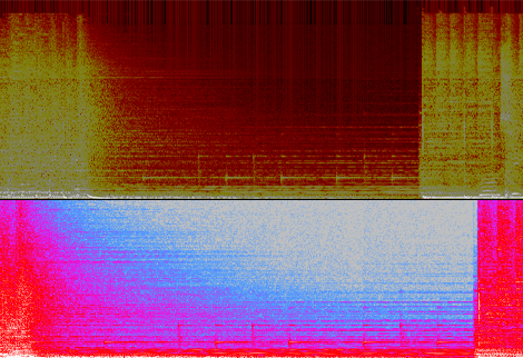
An example image that I have generated can be seen below. On top is the spectrogram of a music file from my implementation and under it is the spectrogram of the same section generated from audacity.
enter image description here

My concern is the vertical lines that show up from my implementation, which are most visible in the higher frequencies. They may interfere with other stuff I will try to do later on. Has anyone ever had the same problem or know the cause? How can I get rid of them?

Additional information: I use hamming window with 50% overlap (using different windows has not helped)

$\endgroup$

5 Answers 5

6
$\begingroup$

After wasting forever on this problem, I found that it was just a question of window function. Doh!

Window functions that are not zero-ended produce these vertical lines. For example, Rectangular Window, Hamming Window, Gaussian Window (with low sigma) produce these lines, and Barlett Window, Hanning Window, Blackmann Window, Welch Window, don't.

I had tried other window functions but maybe during my tests, I made a coding mistake so I didn't find the fix. Moral of the story : do tests carefully!

$\endgroup$
4
$\begingroup$

The vertical lines you see could be clipping. I assume you took a loud MP3 file, decoded it to something like a linear PCM-Wave whith clipping and feed your program with it. As far as, I know Audacity decodes MP3 to 32bit floats internally which does not suffer from clipping issues. This could explain why the Audacity spectrogram looks clean.

So, if this is true, your software is probably OK but your MP3 is simply too loud. The compression artefacts will make samples values go beyond the valid range and a decoder that outputs integer samples would have to do clipping.

$\endgroup$
2
  • 1
    $\begingroup$ Interesting, I did not know about clipping. In support of your theory, the vertical lines do appear stronger near the peaks of the waveform. On the other hand, in the sample image I presented, there is a lot of them and that section is much quieter than the rest of the song, so I'm not sure clipping would be the cause there. I'm currently using Media Foundation libraries and it may be difficult to figure their internal representation. Any good non-GPL library that works like audacity I could try? $\endgroup$ Commented Jan 3, 2013 at 17:26
  • $\begingroup$ Audacity can display clipping as red vertical lines over top of the waveform, but not over the spectrum. View → Show Clipping $\endgroup$
    – endolith
    Commented Jan 3, 2013 at 23:33
2
$\begingroup$

What you are seeing is spectral leakage, which does vary based on the windowing function, as you've seen. In window function selection, there is a tradeoff of frequency resolution, spectral leakage, and amplitude accuracy. Some applications of fft might find the major spectral leakage of a boxcar/no-window function acceptable, as the frequency resolution is better.

For a visual readout of random audio data, like your spectrogram, a windowing function like hanning does much better.

$\endgroup$
1
$\begingroup$

Vertical lines in a sequence of overlapped FFT results can be the result of impulse noise, which is wide spectrum. The can be caused by misplaced samples, skipped samples, zeroed samples or greatly distorted samples in some of the audio data fed to some subset of the spectrograph's FFTs. If it shows up in near silence, it could be sample or arithmetic quantization noise, stuff you could throw away if you are looking for an onset over some threshold well above the noise floor.

$\endgroup$
1
  • $\begingroup$ Doesn't show up in near silence. The samples -look- ok. I'll try with a different MP3 decoder (though the same song in WAV format has the same problem) and maybe a different FFT library to see if that's an issue. $\endgroup$ Commented Jan 4, 2013 at 16:45
0
$\begingroup$

I think you need to look at enough data to get a feel for how the spectrogram looks. Spectrograms often have what looks like vertical lines or columns as a result of the time windows used to compute each section of the spectrogram. The higher frequencies seem to show this more because you get a representation of greater energy (by color or intensity) distributed toward the top of the spectrogram where it stands out. What other kinds of things do you want to do with the data?

$\endgroup$
2
  • $\begingroup$ I'll be taking the derivative in the time direction (if that is a correct way of saying it) for onset detection. There's a couple of ways to get around the vertical lines (such as setting them to 0, or blurring) but they are all suboptimal to removing the lines to begin with, if doable. $\endgroup$ Commented Jan 3, 2013 at 17:29
  • $\begingroup$ Not sure what you mean by "onset". If you mean the start of the music signal, I would say this is really a time domain problem and doesn't require FFT information. I would write an energy detection algorithm and look for energy above a certain threshold. $\endgroup$ Commented Jan 4, 2013 at 15:48

Your Answer

By clicking “Post Your Answer”, you agree to our terms of service and acknowledge you have read our privacy policy.

Not the answer you're looking for? Browse other questions tagged or ask your own question.