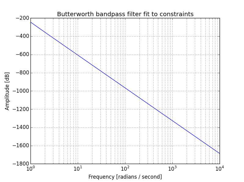
I am trying to build a Butterworth bandpass filter. My intent is to have a pass band between $250\textrm{ Hz}$ and $1000\textrm{ Hz}$. However the plot doesn't look right, as can be seen from the following graph:
Below is my code:
import scipy
import numpy as np
from scipy import signal
import matplotlib.pyplot as plt

#apply bandpass filter
fs = 8000
fso2 = fs/2.
N,Wn = scipy.signal.buttord(wp=[250./fso2,1000./fso2], ws=[200./fso2,1200./fso2],
   gpass=0.1, gstop=30.0)

b, a = signal.butter(N, Wn, 'band', True)
w, h = signal.freqs(b, a, np.logspace(0, 4, 500))
plt.semilogx(w, 20 * np.log10(abs(h)))
plt.title('Butterworth bandpass filter fit to constraints')
plt.xlabel('Frequency [radians / second]')
plt.ylabel('Amplitude [dB]')
plt.grid(which='both', axis='both')
plt.show()

