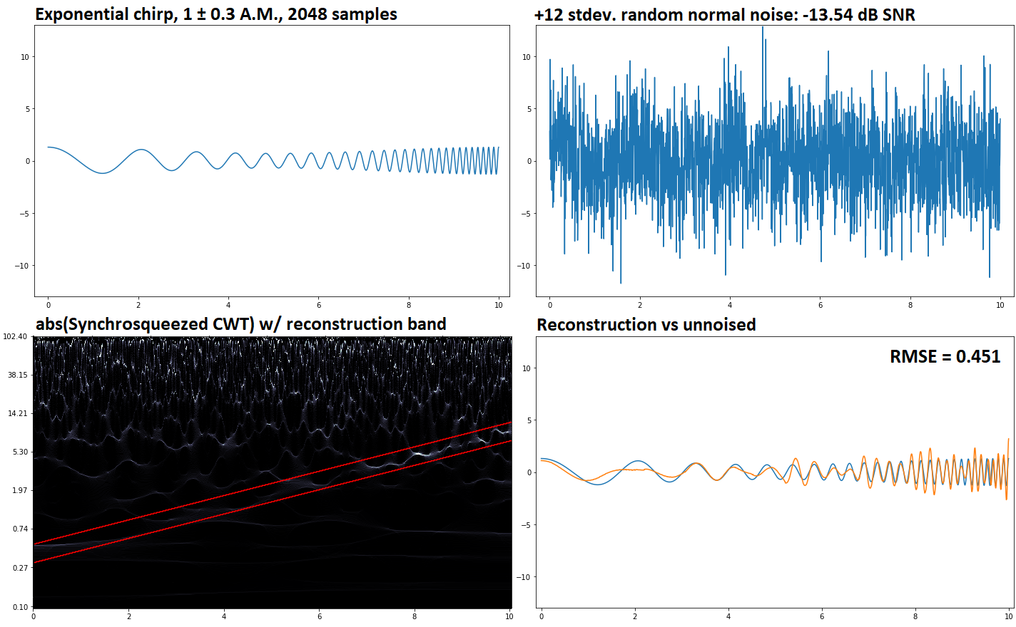
"Synchrosqueezing". Never heard of that before, but it looks suspiciously similar to something I devised years ago. In fact, looking at a description, it just so happens to be the same thing.
You're looking at the actual scalogram of the signal. Note: "scalogram", not "spectrogram". A spectrogram takes place in the time-frequency plane. The horizontal coordinate is the time, the vertical coordinate is the frequency, with equal spacing between 0 Hz, 100 Hz, 200 Hz, 300 Hz and so on.
A scalogram is in the time-scale plane - which is the distinguishing feature of time-scale transforms like the wavelet, S and Q transforms. Its main difference is that the "scale" is logarithmic. What's called "scale" in wavelet analysis is, essentially, the reciprocal of frequency, so that a scalogram is - equally so - the depiction of frequency on a logarithmic scale. That means there is equal spacing between octaves, and the bottom of the graph is not 0 Hz, but the base frequency included in the analysis, whatever that may be. Logarithm of scale is negative logarithm of frequency, so the diagrams would be upside-down.
"synchrosqueezing" is one and the same as is called "frequency reassignment" for spectrograms. A bona fide spectrogram (or scalogram) would show not just the intensity (e.g. by color coding or brightness) but also the phase. The way I do it is to show the amplitude by brightness and the phase by color. In contrast, the spectograms (and scalograms) most people think of or are familiar with show only the amplitude. The spectrogram in Audacity, for instance, shows only amplitude, not phase.
The proper way to handle phase, short of outright depicting it, is to use it by reassigning frequencies. The inverse process is that of trying to re-insert phase into an amplitude only spectrogram or scalogram, which entails another range of methods; the earliest of which was called the "vocoder".
Um ... the NSA already has secret patents on some of the methods related to frequency relocation; except some are no longer secret. The one that slipped out is valid until the late 2020's but works with relocation and spectrograms, rather than scalograms. As far as I'm aware, the other patents are still secret (officially speaking). Their secret synchrosqueezing-related patents are probably still under wraps.
Here's what a scalogram looks like without relocation, but with the phase color-coded ... in 1/4 real-time.
https://www.youtube.com/watch?v=6orozX1GD1w
The largest scale (and smallest frequency) is at the top, the smallest scale (and largest frequency) is at the bottom.
If you pay careful attention to the depiction, you will notice that there are two naturally occurring components. The rate of variation of the phase is the same, for a given component, irrespective of its vertical location on the diagram. That shows that we're picking up the same natural frequency for a single component, via the different channels or "voices" that comprise each row in the diagram. So, when it's relocated, all of that component is added up and relocated at the spot corresponding to its natural frequency.
What's its natural frequency? The rate at which the phase cycles through. The diagram is 1/4 second across, and you can see it cycling through the red, yellow, green, cyan, blue, magenta, back to red about 15 times across the diagram. So, it's about 60 Hz. According to the video description, the top is MIDI -37, the bottom is at MIDI 117. The sound is at 1/4 speed.
You'll see in the diagram a second component, mostly on the bottom, with much more tightly-spaced cycles ... so much so that it's virtually whited out. That's another sound component.
The transform used is not bona fide wavelet, since it used a different transform windowing function for the reverse direction than for the forward direction. The wavelet transform (unnecessarily) uses the same windowing function for both the forward and reverse transform. Here, the reverse transform is to simply add up the individual components from top to bottom. (The S-transform has a similar prescription for the inverse transform, but with a slight difference that complicates the picture.)
You could, in fact, play each one out separately and get the respective sound component. But the filtering used was not clean, so the high frequency component still carries a bit of the low frequency sound in it. That shows up as the "wigglies" in the higher frequency components.
This is an example with relocation.
https://www.youtube.com/watch?v=itUSUau6DJM
Finally, this is a full run with the heartbeat House Music sound and voice ... that was put up just recently - a replay of the last segment of the one I just showed up above.
https://www.youtube.com/watch?v=nd2J4xTrSHQ
You can literally see the individual syllables of the preacher's speech (and that of the audience members)! And, you see the tone and drum beat. "scale" has been switched to "frequency", so the high end is high frequency, and the low end is low frequency.
This one pretty closely matches the kind of chart you have. But the time resolution is too coarse to see the color-coding of the phase (plus, when YouTube converts the video, is smeared out what coloring was visible).

