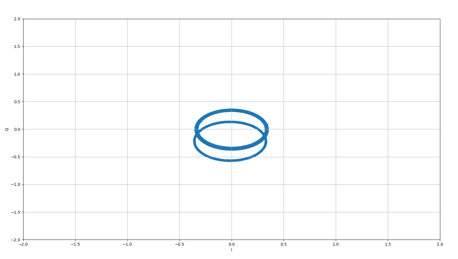
I am experimenting with some signals. I ma generating a 2.47 Ghz signal from signal generator and receiving it by an SDR (LMS7002m Rf chip) with Rx frequency tuned to 2.47 GHz. Upon plotting the received I/Q data I get the following plot. Can anyone help me understanding why there is a second circle below the circle centered at (0,0). Ideally I should be seeing a single circle. .
.
$\begingroup$
$\endgroup$
4
-
$\begingroup$ Can you provide a stem plot of your initial imaginary samples in the time domain? I want to see if every other sample is offset or something else $\endgroup$– Dan BoschenCommented Dec 18, 2019 at 18:37
-
$\begingroup$ drive.google.com/open?id=18VEn0W61XqyuBYF2UBV8eKCTuW9NuUQ0 I am attaching the file link with all the samples I receive. First column is the I values and second column is Q values. I simply plot using python using this command dataframerx.sample(n=3000000,random_state=1).plot(kind='scatter',x='I',y='Q',grid=True,xlim=(-2,2),ylim=(-2,2)) $\endgroup$– tue2017Commented Dec 19, 2019 at 21:57
-
$\begingroup$ I looked at it and agree with @hotpaw2-- -Just look at your Q data versus time and there is an offset in Q at approximately 62000 samples in. (so could either be a temporal offset in your measurement instrument or your SDR) If that answer he gave also makes sense to you, consider marking it as correct to close this question. $\endgroup$– Dan BoschenCommented Dec 19, 2019 at 22:34
-
$\begingroup$ The offset is in Q from the first sample to about 62000 samples in, and then there is no offset after that. Compared to your file size it is a very small portion of the entire data captured. $\endgroup$– Dan BoschenCommented Dec 19, 2019 at 22:51
Add a comment
|
1 Answer
$\begingroup$
$\endgroup$
IQ modulators, demodulators, and test equipment (oscilloscopes, etc.) can have channel imbalance in either or both gain and offset. It looks like the Q channel of either the source or instrumentation changed or adjusted its offset during your measurement.
