2
$\begingroup$

I am working on noise reduction and I need to learn how to analyze spectrograms

I mixed a pure speech file with violet noise in audacity and got the following spectrograms:

Matlab version
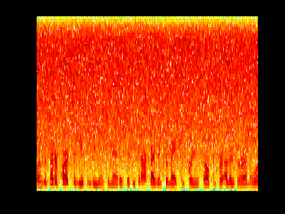
enter image description here

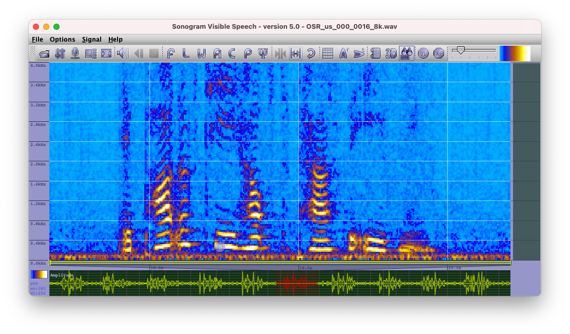
Sonogram version: (enter link description here)

enter image description here

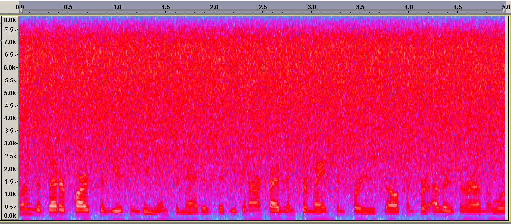
Spectrogram view in Audacity:

enter image description here

What do all the colours mean and why do they look different? Shouldn't everything have the same colours as in the Matlab version? Or are the exact colours not that important, since the darker pattern at the bottom of each figure still look similar in all of them?

--- EDIT :: Further additions: ---

Here is a screenshot of the spectrogram of noisy speech as well as output of my noise reduced sound file.
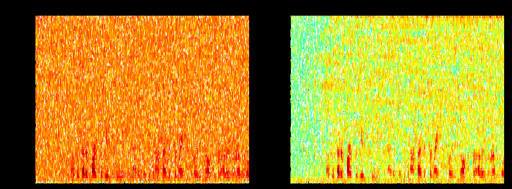
enter image description here

The one on the left is noisy signal while one on the right is the one passed through the noise reduction algorithm. Both figures are plotted through the spectrogram function of matlab, called as follows:

spectrogram(data, hanning(128), 64, 128, 16000)

The number 16000 is the Fs value (sampling frequency) returned by the wavread function used to read in the original noisy speech file into matlab. The sound file is a male adult speaking, mixed with violet noise in audacity

--- EDIT 2: ---

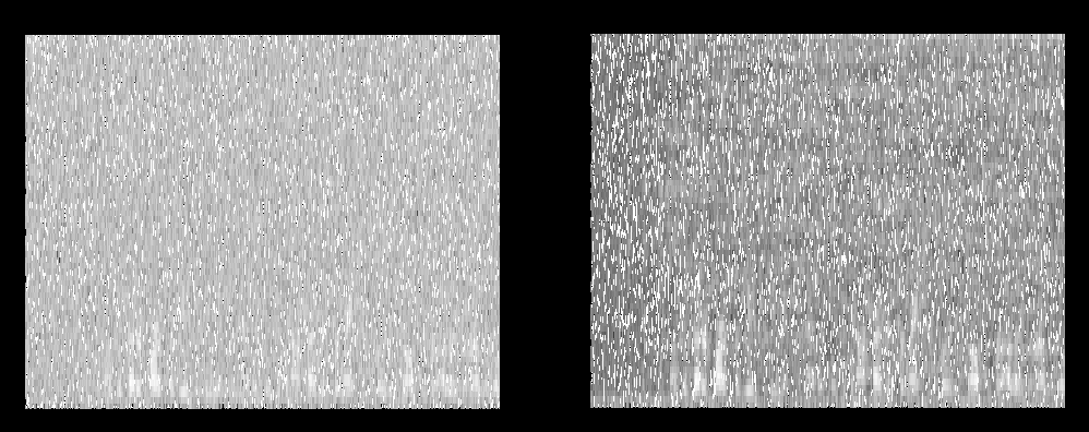
Also, here is the same thing in gray-scale, if it helps
enter image description here

$\endgroup$
5
  • $\begingroup$ Exact color does not matter. Mostly bright color signifies larger intensity(energy). It means low frequencies is having more energy compared to higher frequencies at some regions in your examined signal.It would be better, if you see the properties of your software. Like in audition they describe these correspondence between color and intensity in properties called spectral control. $\endgroup$
    – hari
    Commented Nov 6, 2012 at 5:16
  • $\begingroup$ You should consider if you are looking at spectra of cepstra, which is log10(spectra) $\endgroup$
    – Mikhail
    Commented Nov 6, 2012 at 5:19
  • $\begingroup$ What do you mean by spectra of cepstra? As far as I know I haven't done any log related calculations to get these graphs. I am not sure if the spectrogram function of matlab calculates any logarithms, however. $\endgroup$
    – user13267
    Commented Nov 6, 2012 at 5:25
  • $\begingroup$ @hari: "bright color signifies larger intensity" is not true for Matlab, which uses the jet colormap by default. In this case, dark red is the largest intensity, dark blue is the lowest, and bright yellow or bright green are completely arbitrary values in the middle. This is why the jet colormap should not be used; it makes things look important when they're not, confusing and misleading people. jwave.vt.edu/~rkriz/Projects/create_color_table/color_07.pdf $\endgroup$
    – endolith
    Commented Nov 7, 2012 at 14:51
  • $\begingroup$ but this gives rise to another question: In the article you linked the rainbow colour map does not have any space of white. However in the spectrograms I have plotted through Matlab silence periods show up as dark blue as well as white areas. So what does white mean then? Would that mean low intensity or a value that it could not calculate? $\endgroup$
    – user13267
    Commented Nov 8, 2012 at 0:35

2 Answers 2

3
$\begingroup$

The spectrograms look different because they use:

  • Different parameters for the FFT size and hop size (window overlap ratio).
  • They simply use different palettes. The spectrogram gives you an array of numbers, which are scaled and map to a color palette to produce a color image. Matlab's colormaps are listed here - by default it uses "jet" ; so the time-frequency bins of lowest energy are colored in blue, and those of highest energy are colored red.
$\endgroup$
2
  • $\begingroup$ So does that mean the colour doesn't exactly matter? Would always plotting spectrogram in grayscale be a better idea? $\endgroup$
    – user13267
    Commented Nov 7, 2012 at 6:29
  • $\begingroup$ The color palette is only here to make the spectrogram readable. More generally, the spectrogram plot is a qualitative tool, not quantitative. What is helpful are the relative intensities, the patterns, etc, not the price RGB value at t-f bin (0.05, 523)... $\endgroup$ Commented Nov 7, 2012 at 6:50
0
$\begingroup$

The X-Achsis is the Time and the Y-Achsis is the Frequency.

https://github.com/Christoph-Lauer/Sonogram

enter image description here

$\endgroup$

Your Answer

By clicking “Post Your Answer”, you agree to our terms of service and acknowledge you have read our privacy policy.

Not the answer you're looking for? Browse other questions tagged or ask your own question.