1
$\begingroup$

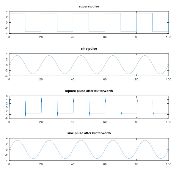
I am using butterworth filter for both square pulse and sine wave. In case of square pulse, butterworth produces some sharp ripple of edges of square pulse in time domain for varying butterworth order (wn > 2). But in case of sine wave, I don't see any ripple. Could anyone please explain the reason behind that? Matlab code is following along with plots.

close all

clear all
T = 1/10;
t = linspace(0,T,1001);

s = square (2*pi*100*t);

fs=10/200; % sampling frequency
fc=0.2; % fc normalized
offset=0;
amp=3.3;
duty=50;
t=0:0.01:100;%100 seconds
sq_wav=offset+amp*square(2*pi*fs.*t,duty);
sin_wav = offset + amp*sin(2*pi*fs.*t);
disp(length(sin_wav));

N = length(sq_wav);
disp(N);
#disp(t(1:10));
t1 = [0:N-1];
disp(t1(1:10));
disp(fs);
wn = 15; % filter order

[b,a] = butter(wn, fc);

[h,w] = freqz(b,a);

out_sq = filter(b,a,sq_wav);
out_sin = filter(b,a,sin_wav);

subplot (4, 1, 1)
plot(t(1:end),sq_wav(1:end))
title("square pulse");

subplot (4, 1, 2)
plot(t(1:end),sin_wav(1:end))
title("sine pulse");

subplot (4, 1, 3)
plot(t(1:end),out_sq(1:end))
title("square pluse after butterworth");

subplot (4, 1, 4)
plot(t(1:end),out_sin(1:end))
title("sine pluse after butterworth");

Here is the output of this code:

enter image description here

$\endgroup$

1 Answer 1

2
$\begingroup$

This happens because when lowpass filtering, you remove the high-frequency content that gives the square pulses their sharp edges. Now, if you're not yet versed in Fourier analysis of signals this will be a bit tough, but I'll provide some graphs to show what I mean.

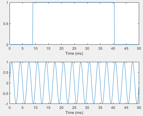
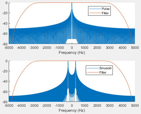
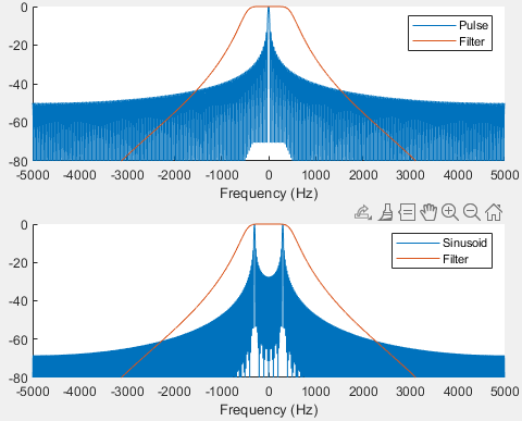
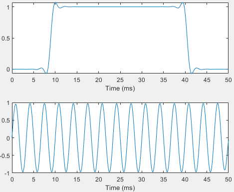
Let's take a simple pulse and a sinusoid like the ones you have. We're going to filter them with a simple 4-th order Butterworth filter. Below are the time-domain and frequency-domain plots of the signals. The spectrum of the filter is also included. The spectrum plots are in decibels (dB).

enter image description here enter image description here

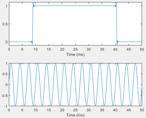
If you don't know, filtering in the time domain is multiplication in the frequency domain. So you can look at the frequency spectrums and multiply them together, seeing where the attenuation takes place. You can see that the pulse has more significant contributions from high frequencies compared to the sinusoid. So after filtering, the sinusoid will be less distorted than the pulse which is exactly what we see below

enter image description here

We can take this a step further and remove more frequency content by using a tighter filter. Below are the same spectrums with the new filter. You see that the pulse is now even more distorted, while the sinusoid remains relatively unchanged.

enter image description here enter image description here

$\endgroup$
2
  • $\begingroup$ Thanks so much for explaining with the graph. Appreciate it. $\endgroup$ Commented May 22, 2021 at 6:17
  • 1
    $\begingroup$ @ShadekurRahman Note that there are other ways to approach this phenomenon. The Gibbs phenomenon mathematically describes this in time-domain, specifically looking at jump discontinuities, where there is significant frequency content. $\endgroup$
    – Envidia
    Commented May 22, 2021 at 6:25

Your Answer

By clicking “Post Your Answer”, you agree to our terms of service and acknowledge you have read our privacy policy.

Not the answer you're looking for? Browse other questions tagged or ask your own question.