added 11 characters in body
Source Link
Peter K.
  • 26k
  • 9
  • 47
  • 93

As an example of what I mean, let's have a look at a simple sinusoid (though I see you're actually assuming double gamma functions; I may rework this later to use those).

This models the signals as: $$ y_n(t) = \sin(\omega t + \phi_n) $$$$ y_p(t) = \sin(\omega t + \phi_p) $$ so the only difference between them is the phase $\phi_n = (n-1)\pi/6$$\phi_p = (p-1)\pi/6$.

The top plot is the mean signal $\bar{y}(t)$ and the bottom plot shows the Pearson coefficient between $\bar{y}$ and $y_n$$y_p$ for $n=1\ldots 6$$p=1\ldots 6$ (so $n=6$).

enter image description here

As you can see, the Pearson coefficient varies quite widely even in this simple example.


R Code Below

# 26438

Nsigs <- 6
T<- 1024
omega <- 2*pi*0.00982734982
t <- 0:(T-1)

y <- matrix(,nrow = T, ncol = Nsigs)
phi <- c(0, 1*pi/6, 2*pi/6, 3*pi/6, 4*pi/6, 5*pi/6 )

for (idx in 1:Nsigs)
{
  #phi[idx] <- runif(1)*2*pi
  y[,idx] <- sin(omega*t + phi[idx])  
}

mean <- rowSums(y) / Nsigs

total <- matrix(,nrow = T, ncol = Nsigs+1)
total[,1] <- mean
total[,2:(Nsigs+1)] = y

pearson <- cor(total,use="complete.obs", method="pearson")

par(mfrow=c(2,1),pty="m")
plot(t,mean, type="l")
title("Mean value")

plot(1:6, pearson[1,2:7], pch=19, col="blue")
title("Pearson coefficient")

As an example of what I mean, let's have a look at a simple sinusoid (though I see you're actually assuming double gamma functions; I may rework this later to use those).

This models the signals as: $$ y_n(t) = \sin(\omega t + \phi_n) $$ so the only difference between them is the phase $\phi_n = (n-1)\pi/6$.

The top plot is the mean signal $\bar{y}(t)$ and the bottom plot shows the Pearson coefficient between $\bar{y}$ and $y_n$ for $n=1\ldots 6$.

enter image description here

As you can see, the Pearson coefficient varies quite widely even in this simple example.


R Code Below

# 26438

Nsigs <- 6
T<- 1024
omega <- 2*pi*0.00982734982
t <- 0:(T-1)

y <- matrix(,nrow = T, ncol = Nsigs)
phi <- c(0, 1*pi/6, 2*pi/6, 3*pi/6, 4*pi/6, 5*pi/6 )

for (idx in 1:Nsigs)
{
  #phi[idx] <- runif(1)*2*pi
  y[,idx] <- sin(omega*t + phi[idx])  
}

mean <- rowSums(y) / Nsigs

total <- matrix(,nrow = T, ncol = Nsigs+1)
total[,1] <- mean
total[,2:(Nsigs+1)] = y

pearson <- cor(total,use="complete.obs", method="pearson")

par(mfrow=c(2,1),pty="m")
plot(t,mean, type="l")
title("Mean value")

plot(1:6, pearson[1,2:7], pch=19, col="blue")
title("Pearson coefficient")
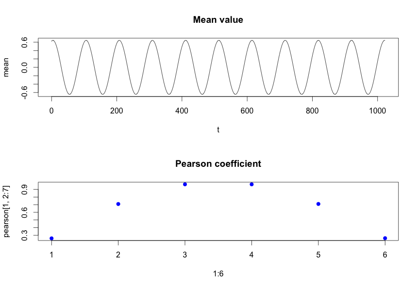
As an example of what I mean, let's have a look at a simple sinusoid (though I see you're actually assuming double gamma functions; I may rework this later to use those).

This models the signals as: $$ y_p(t) = \sin(\omega t + \phi_p) $$ so the only difference between them is the phase $\phi_p = (p-1)\pi/6$.

The top plot is the mean signal $\bar{y}(t)$ and the bottom plot shows the Pearson coefficient between $\bar{y}$ and $y_p$ for $p=1\ldots 6$ (so $n=6$).

enter image description here

As you can see, the Pearson coefficient varies quite widely even in this simple example.


R Code Below

# 26438

Nsigs <- 6
T<- 1024
omega <- 2*pi*0.00982734982
t <- 0:(T-1)

y <- matrix(,nrow = T, ncol = Nsigs)
phi <- c(0, 1*pi/6, 2*pi/6, 3*pi/6, 4*pi/6, 5*pi/6 )

for (idx in 1:Nsigs)
{
  #phi[idx] <- runif(1)*2*pi
  y[,idx] <- sin(omega*t + phi[idx])  
}

mean <- rowSums(y) / Nsigs

total <- matrix(,nrow = T, ncol = Nsigs+1)
total[,1] <- mean
total[,2:(Nsigs+1)] = y

pearson <- cor(total,use="complete.obs", method="pearson")

par(mfrow=c(2,1),pty="m")
plot(t,mean, type="l")
title("Mean value")

plot(1:6, pearson[1,2:7], pch=19, col="blue")
title("Pearson coefficient")
Source Link
Peter K.
  • 26k
  • 9
  • 47
  • 93

As an example of what I mean, let's have a look at a simple sinusoid (though I see you're actually assuming double gamma functions; I may rework this later to use those).

This models the signals as: $$ y_n(t) = \sin(\omega t + \phi_n) $$ so the only difference between them is the phase $\phi_n = (n-1)\pi/6$.

The top plot is the mean signal $\bar{y}(t)$ and the bottom plot shows the Pearson coefficient between $\bar{y}$ and $y_n$ for $n=1\ldots 6$.

enter image description here

As you can see, the Pearson coefficient varies quite widely even in this simple example.


R Code Below

# 26438

Nsigs <- 6
T<- 1024
omega <- 2*pi*0.00982734982
t <- 0:(T-1)

y <- matrix(,nrow = T, ncol = Nsigs)
phi <- c(0, 1*pi/6, 2*pi/6, 3*pi/6, 4*pi/6, 5*pi/6 )

for (idx in 1:Nsigs)
{
  #phi[idx] <- runif(1)*2*pi
  y[,idx] <- sin(omega*t + phi[idx])  
}

mean <- rowSums(y) / Nsigs

total <- matrix(,nrow = T, ncol = Nsigs+1)
total[,1] <- mean
total[,2:(Nsigs+1)] = y

pearson <- cor(total,use="complete.obs", method="pearson")

par(mfrow=c(2,1),pty="m")
plot(t,mean, type="l")
title("Mean value")

plot(1:6, pearson[1,2:7], pch=19, col="blue")
title("Pearson coefficient")